Seattle GuZheng Academy
RESEARCH
CREATIVE STRATEGY
STORYTELLING
BRANDING
VISUAL COMMUNICATION
Client: Seattle GuZheng Academy
Brand: Ying
Creative Director: Ying
Branding: Ying
Project done while employed at Seattle GuZheng Academy (2024)
PROBLEM
The Seattle Guzheng Academy is an authority on music in the Seattle area with more than 15 years of teaching experience, but the current logo does not effectively capture the essence of the guzheng, nor does it reflect the academy's rich cultural heritage and modern teaching methods.
INSIGHT
The logo should incorporate elements that symbolize both the instrument and the studio's role in cultural exchange and education.
SOLUTION
The new logo will blend traditional Chinese motifs with modern design elements, creating a visually appealing and culturally significant emblem and carefully selected color palette will evoke the elegance and depth of Chinese culture while appealing to a modern audience.
Seattle GuZheng Academy is more than just a music education institution.
It acts as a cultural bridge between China and America. Committed to preserving and promoting Chinese traditional music.
LOGO Design
The logo for the Guzheng Academy features the shape of the Guzheng instrument, symbolizing our focus on traditional music.
The circle represents the blending of Chinese and American cultures, highlighting our role as a cultural bridge. The Chinese character signifies our commitment to Chinese heritage and language.
Together, these elements reflect our mission to promote cultural harmony through music education.
An innovative label design for the GuZheng Academy.
Enhancing management, sales, and student experience through color-coded grading, transparent pricing of materials, and QR code-enabled listening functions.
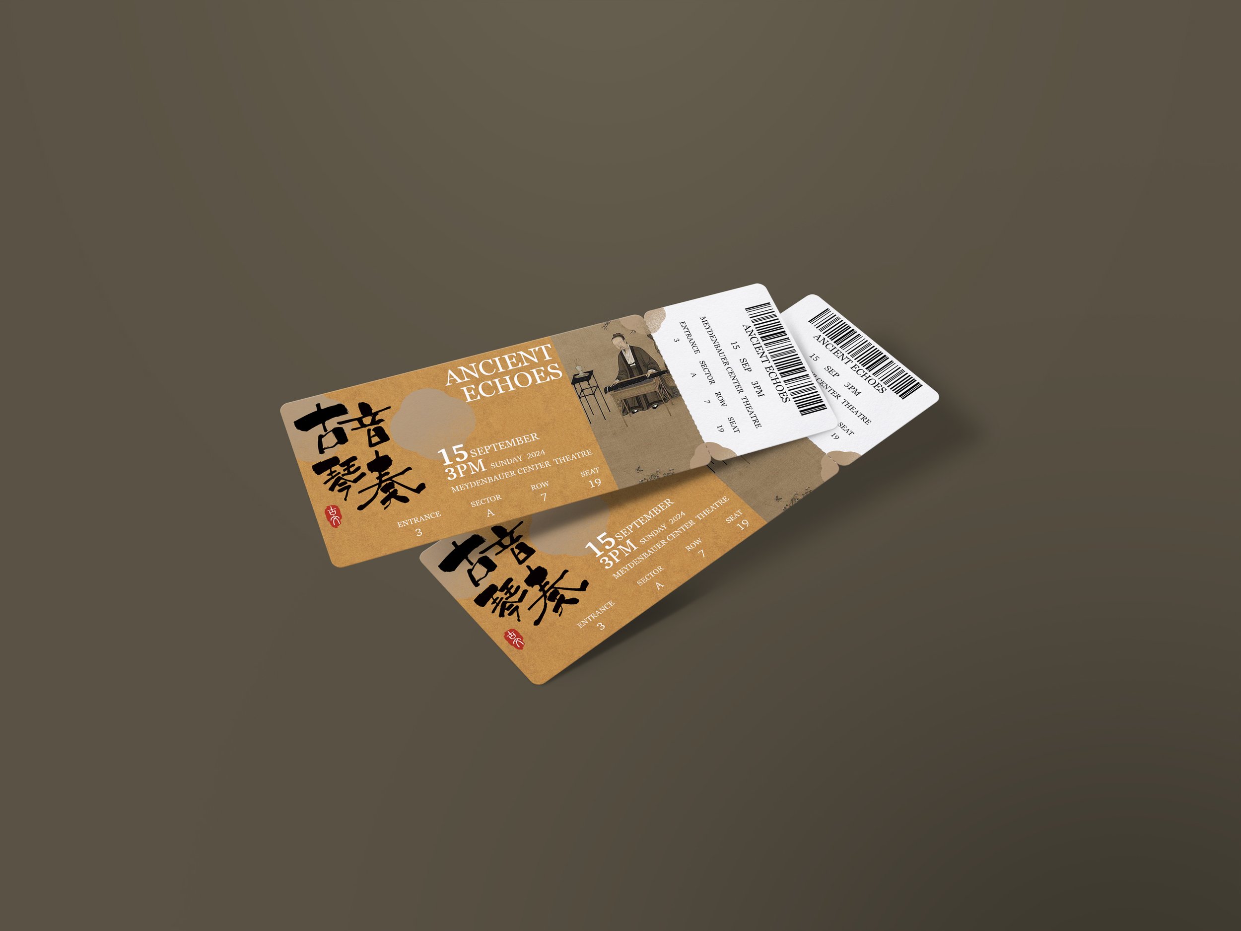
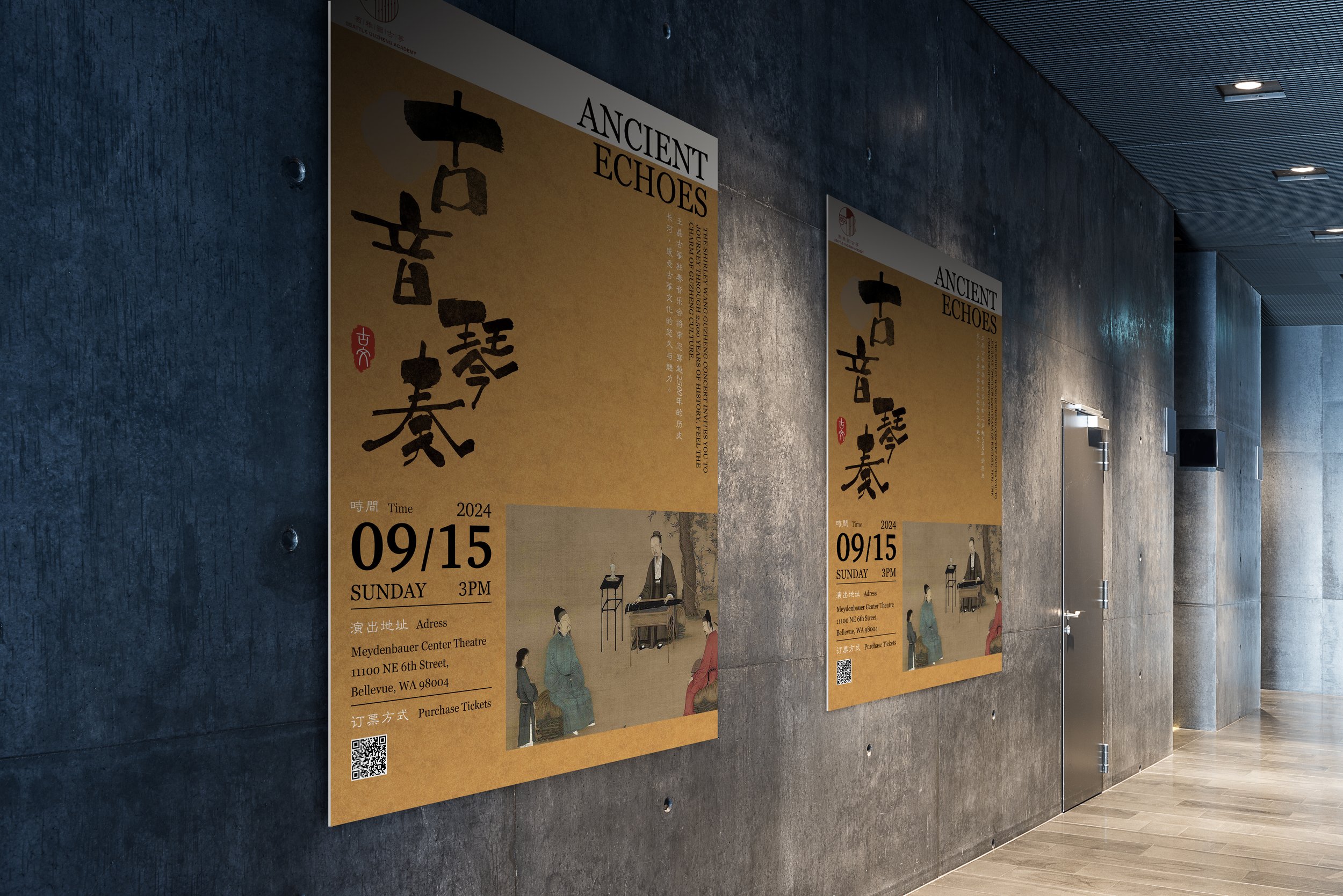
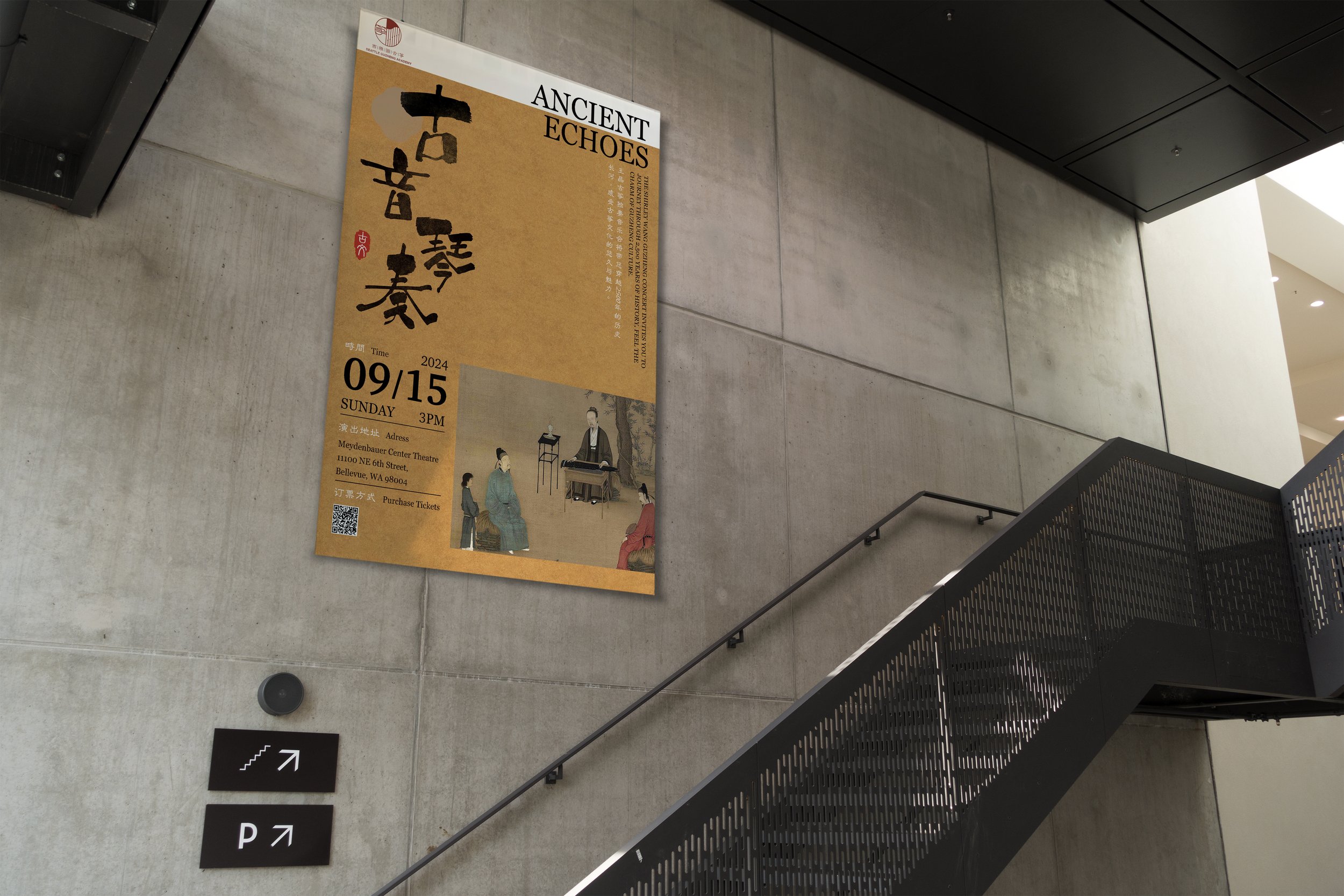
Explore the rich tapestry of traditional Chinese culture and music through concert series.
Posters artfully blend elements of Chinese calligraphy, ancient seals symbolizing authority, classical paper backgrounds, and renowned historical GuZheng paintings, offering a visual journey into the heart of GuZheng tradition and heritage.


